A guide to selecting an accessible typeface
Selecting a typeface that suits your brand, is versatile enough for your products, and is accessible can be a daunting task with the multitude of fonts available. In this blog post, I will walk you through some key factors to consider when selecting an accessible typeface that is also functional and visually appealing.
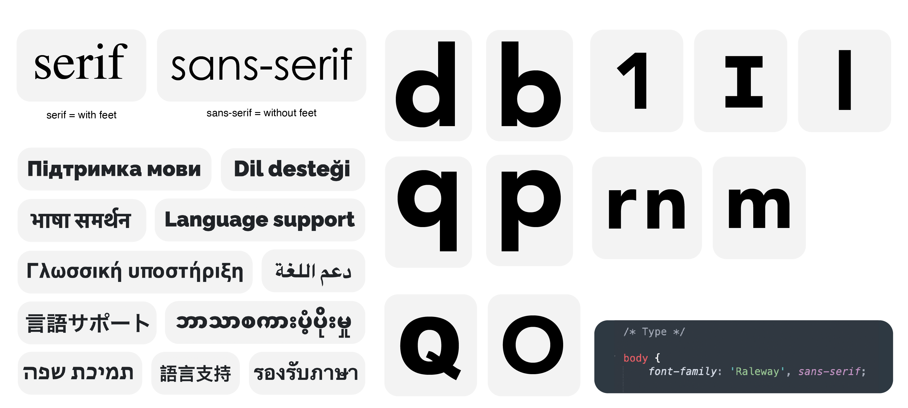
Serif or sans-serif
There are various font styles to choose from when it comes to typography, but the two main overarching styles are serif and sans-serif. In addition, fonts can also fall into style categories such as display, handwriting, and monospace.
The terms serif and sans-serif are commonly used in typography, but what do they actually mean? Essentially, serif refers to the small lines or flourishes that are added to the end of strokes in letters in typefaces such as Times New Roman, giving the appearance of "feet". In contrast, sans-serif fonts like Arial and Helvetica lack these decorative flourishes, giving them a cleaner and more modern look. While serif fonts have traditionally been preferred for print due to their legibility, sans-serif fonts are often seen as more contemporary.
The question about which one is easier to read is still up for debate, and research suggests that the effectiveness of serif versus sans-serif fonts may depend on the individual reader.
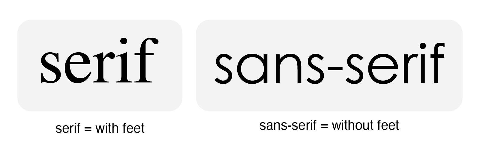
Font availability
When it comes to selecting a font for your website, availability is a key consideration. You want to make sure that the font you choose is easily available to your website visitors, whether it's pre-installed across all devices or easily available through a service like Google Fonts. It's also a good idea to have a fallback option in case the font is unavailable, as this can help ensure that your website remains readable and visually appealing regardless of any technical issues.
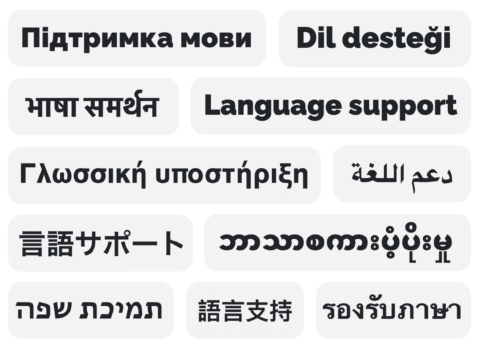
Language support
It's important to ensure that a font supports non-Latin characters. This means checking if the font can display characters from other languages, such as Chinese, Arabic, or Cyrillic. It's also important to consider whether the font will still be legible if people change the language of your website. Some fonts may not be designed to display certain character sets, which can make the text appear garbled or illegible. By choosing a font that supports a wide range of characters, you can ensure that your website is accessible to people from around the world.
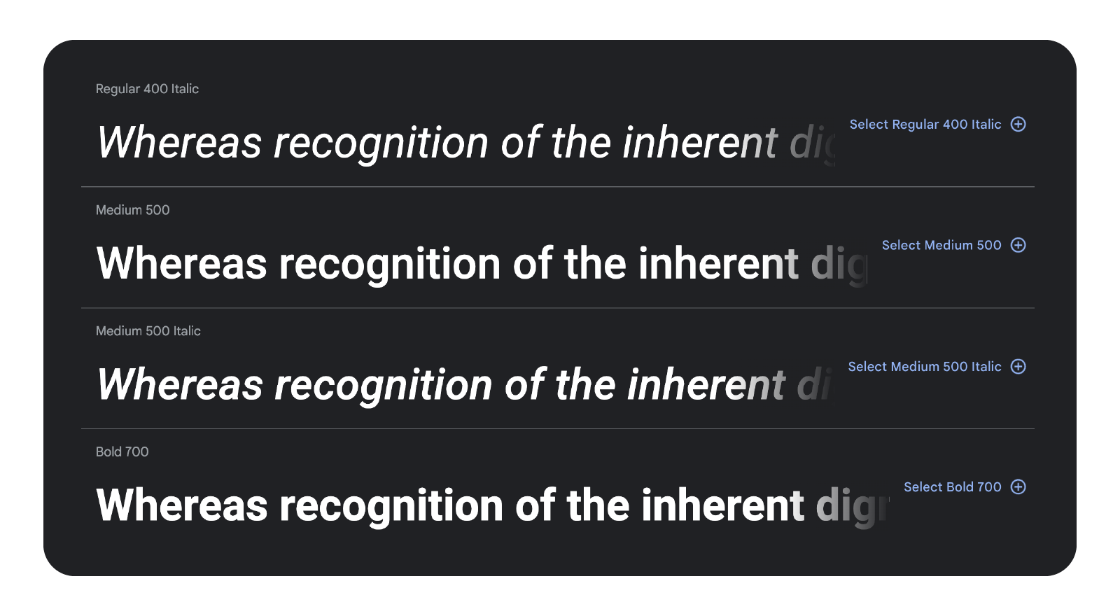
Font variations
Check that the font has multiple weights and styles, such as bold or italic variations.
Avoid letter mirroring
Avoid using mirrored letter shapes that look the same when flipped horizontally, such as lower case d (D) and b (B) or p (P) and q (Q). Although designers may use mirrored letter shapes for consistency and efficiency, it can create obstacles for some readers, especially those with dyslexia. Unique character shapes can improve the reading experience for those with dyslexia and make your content more inclusive.

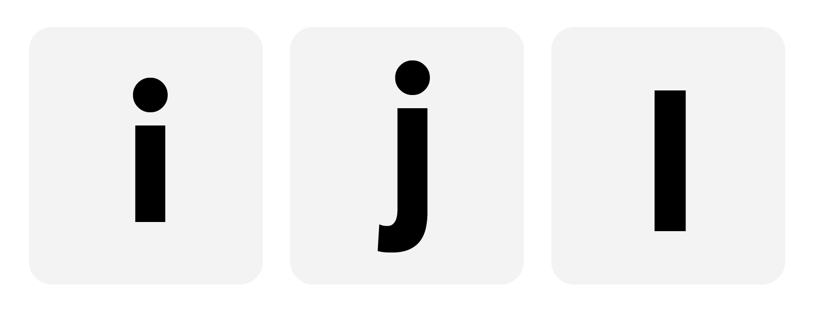
Make sure letters are clearly identifiable
Make sure there are variations in style between the number 1 (one), uppercase letter I (i), and lowercase letter l (L).

Look at the dot on lowercase i (I) and j (J). A larger dot will differentiate lowercase i from an l (L) or uppercase I (i).
Look at the tail of uppercase Q (q). A stronger tail will prevent confusion between O (letter o or number zero) and Q (q).

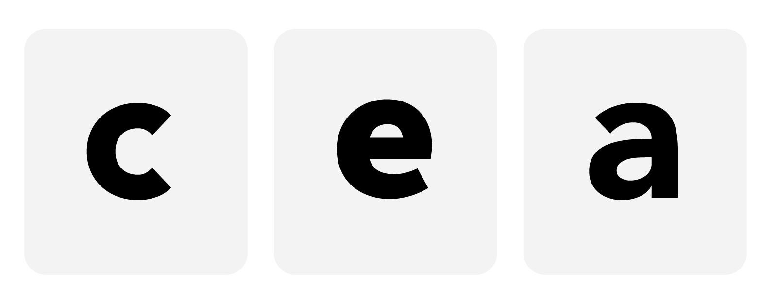
Check font aperture. Can the lowercase letters c (C), e (E), or a (A) be confused with o (letter o or number zero)?
Check spacing between letters
Proper spacing between letters is essential for legibility and readability. It is important to ensure that there is enough space between letterforms to avoid confusion, such as mistaking the combination of r (R) and n (N) for m (M). Tight spacing can also cause letters to merge together, making it difficult to read.

Make sure font weight isn’t too thin
Check thinness of line stroke and narrow-width fonts. Letters that are too thin can cause reading difficulties for people who are visually impaired, or are viewing the content on a low contrast background.
Make sure the font meets WCAG guidelines
The Web Content Accessibility Guidelines (WCAG) outline specific requirements to make text accessible. Two important criteria are:
1.4.12 Text Spacing (Level AA)
The line height (line spacing) should be at least 1.5 times the font size, and spacing following paragraphs should be at least 2 times the font size. Letter spacing (tracking) should be at least 0.12 times the font size, and word spacing should be at least 0.16 times the font size.
1.4.4 Resize text (Level AA)
Text should be able to be resized up to 200 percent without loss of content or functionality, except for captions and images of text.
Check word shapes
It is important to consider the shape of the words when they are written in uppercase and lowercase characters. Some fonts may change the overall shape of a word, which can make them harder to read and recognise.
Some guidelines for your content writing
Once you have picked a font here are some tips for writing your content.
Use italics, all caps, and underlines sparingly, or avoid them altogether if possible. These styles can make the text harder to read, especially for people with reading difficulties. Instead, use a combination of upper and lowercase characters to maintain the original word shape.