Modernising a digital giant
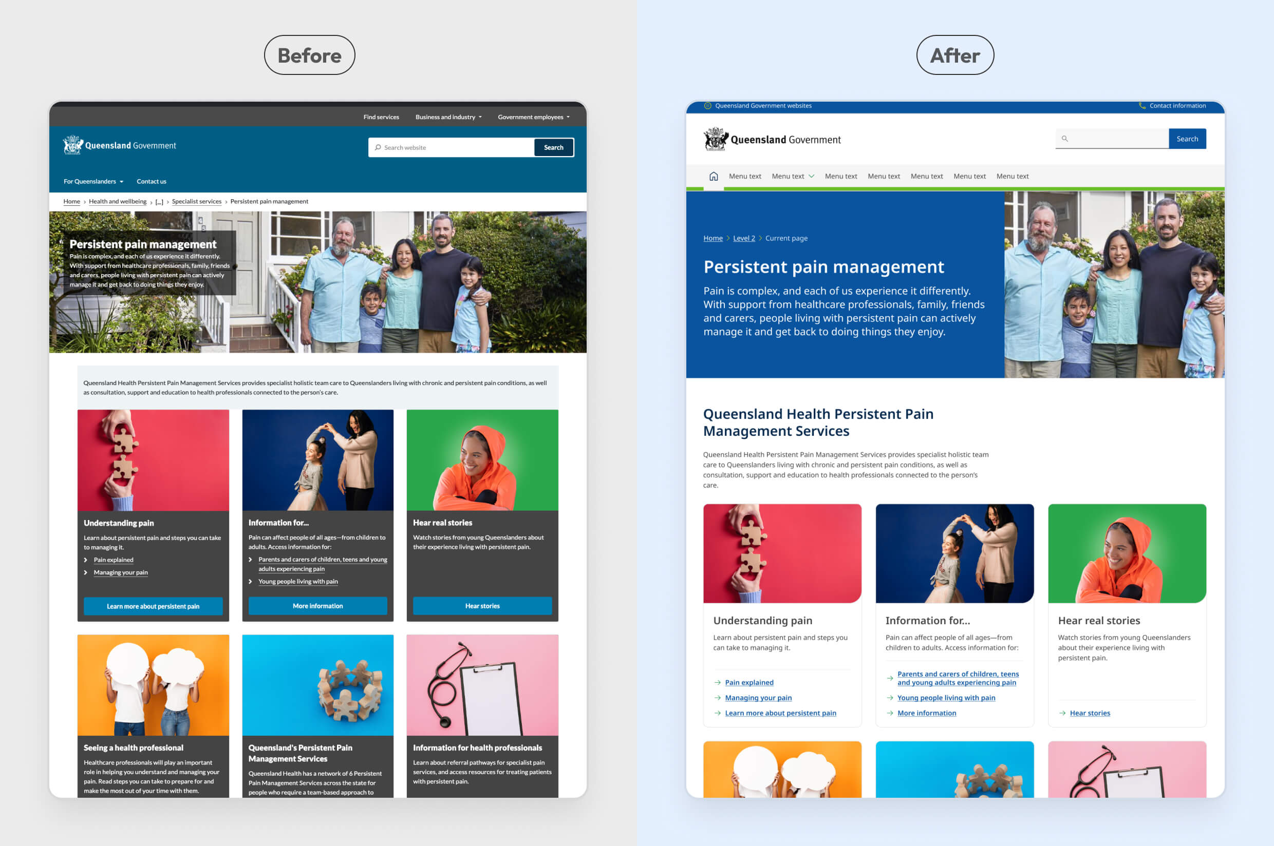
I led design through the migration of qld.gov.au, Queensland Government's 9,500+ page primary website, from a legacy design system to a new government-wide one. My work spanned auditing and rationalising the existing design ecosystem, determining what to adopt, redesign or retire, and helping coordinate the transition across 17+ agencies on a platform serving more than 300,000 visits a day.
The challenge
qld.gov.au had evolved over more than a decade on a legacy design system. Its templates, components and custom implementations supported a large content ecosystem spanning more than 9,500 pages, with content managed independently across 17+ agencies.
When Queensland Government introduced a new government-wide design system, qld.gov.au needed to move onto it without introducing unnecessary disruption for users or for the teams maintaining the site.
The challenge was not simply to recreate every existing pattern in a new visual language. We needed to understand which parts of the legacy system were still genuinely required, which could be replaced by existing design-system patterns, which needed to be redesigned, and which should no longer exist.
The migration became an opportunity to simplify the system rather than reproduce more than a decade of accumulated complexity.
My role
I led the design work from system audit through to production, collaborating with developers, content specialists, design leadership and agency stakeholders throughout.
My role included leading the audit of all active templates and components, mapping the legacy system against the new design system, identifying gaps, facilitating decisions about what to retain, redesign or retire, and designing new patterns where genuine gaps remained.
I also worked with a graduate designer across part of the uplift, supported agency engagement, reviewed built components against approved designs and design-system standards, and helped coordinate pre-launch quality assurance across the platform.
Approach
We started with an audit, using documentation across the design system, GitHub, and the CMS to review every template and component in active use against the new design system. That gave us a clear picture of what already matched and where the gaps were.
Where the new design system had no direct equivalent, we didn't automatically rebuild the legacy pattern. I ran working sessions with the design director, developers, designers, and content specialists for each gap, weighing how the pattern was actually being used, whether an existing design-system component could already meet the need, whether continued support would introduce unnecessary complexity, and whether accessibility, usability or technical constraints changed the decision. Each gap resolved into one of three outcomes:
Use an existing design-system pattern where it already met the underlying need.
Create a new solution where qld.gov.au had a legitimate requirement not supported by the new design system.
Remove patterns where the need no longer justified continued design and technical maintenance.
Two items, one template and one component, were deliberately deferred rather than forced into this phase, both too complex to redesign responsibly within the migration's timeline, and scoped for future work instead.
We drew the same line at a platform level. Rather than restructure the site, we kept qld.gov.au's shell and layout unchanged and scoped the migration to the UI itself, components, patterns, and visual design. This limited the amount of simultaneous change introduced to users and kept the migration focused on the UI layer rather than combining it with a broader structural redesign.
Key decisions
Unpicking legacy complexity
Some components carried more complexity than a straightforward match-or-gap review could capture. A component could look like a clean match on the surface, while its variants told a different story, some fitting the new system perfectly, others hiding gaps the top-level review would have missed entirely.
13 ways to build 3 buttons
There were 13 different legacy styles for buttons in use across the platform, accumulated over time with no clear mapping between them. Once reviewed, they resolved cleanly into the new design system's three variants: primary, secondary, and tertiary.
Retire
Callout and quote variants, used for the wrong purpose
Callout and quote components with added CTA buttons and images had been used throughout the legacy system as informal promotional panels, a purpose that worked against what callouts and quotes were actually meant to do. The new design system already had better-suited components for that job.
Rather than carry the misuse forward, we retired these variants and advised agencies on alternative content treatments that would achieve the same promotional effect properly.
Retire
Carousel, evidence over prominence
Agencies and executive leadership preferred the carousel for campaign content, valuing the prominent space it gave them in asides. But usage data showed just 2% engagement, and in user testing, no participant interacted with it at all.
The asides themselves were already being scoped for removal in a future project, so rebuilding a component whose home was disappearing anyway made little sense either. I brought both points to the working group, and we retired the carousel, guiding agencies toward simpler patterns better aligned with how people actually used the site.
Retire
Checklist, redundant by design
Not every retirement was about low engagement or risk, some components were simply unnecessary. The checklist component was really just a group of individual checkboxes, easily replicated by stacking them directly rather than maintaining a separate component. I identified that retiring it lost nothing, it was solving a problem the platform no longer needed a dedicated component for.
Redesign
Modals, deferring a decision until it could be made properly
Modals had no equivalent in the new design system, and the initial review left the decision pending. When several agencies asked to keep them, rather than force a permanent answer without enough information, we applied basic styling so existing modals stayed visually consistent with the uplift, without building a full design system component or changing their content.
Because modals had been implemented inconsistently across the site, some through supported code, others through various JavaScript lightbox solutions, I recommended every instance be reviewed during UAT to confirm it still worked as expected.
The bigger question, whether modals were still needed at all, or should become drawers, tooltips, or repositioned page content, I deliberately left for the separate Content Uplift project to resolve topic by topic. A proper design system component would only get designed once that need was actually understood, not before, and not just because agencies had asked to keep the status quo.
Redesign
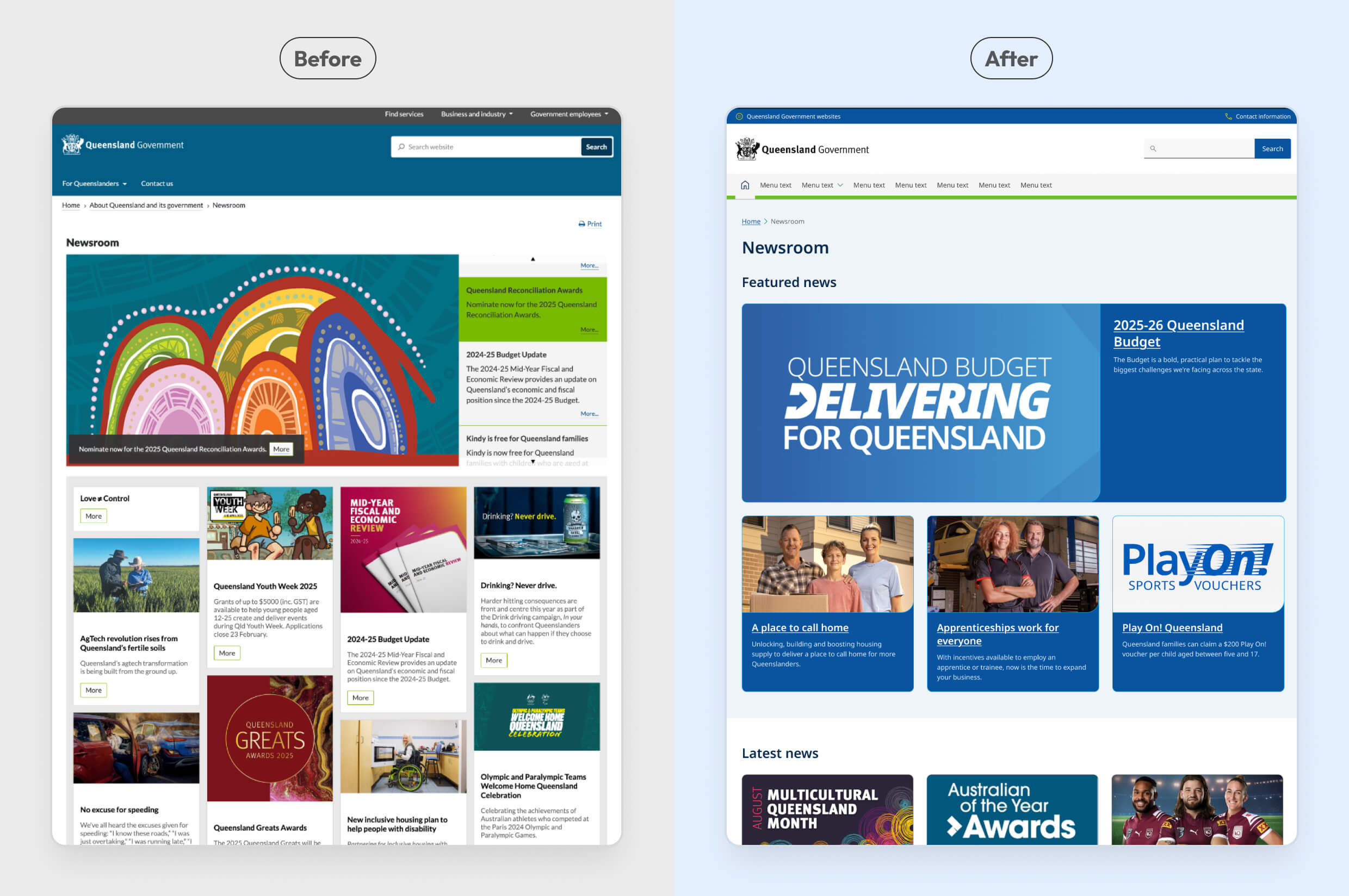
Newsroom, replacing a fully custom build
The previous Newsroom template was entirely custom-built, with no equivalent anywhere in the new design system. Rather than migrate that complexity as-is, I redesigned it in consultation with the Department of Premier and Cabinet, treating it as a deliberate stepping stone ahead of a more significant upgrade planned for a later phase, not a final destination in itself.
Redesign
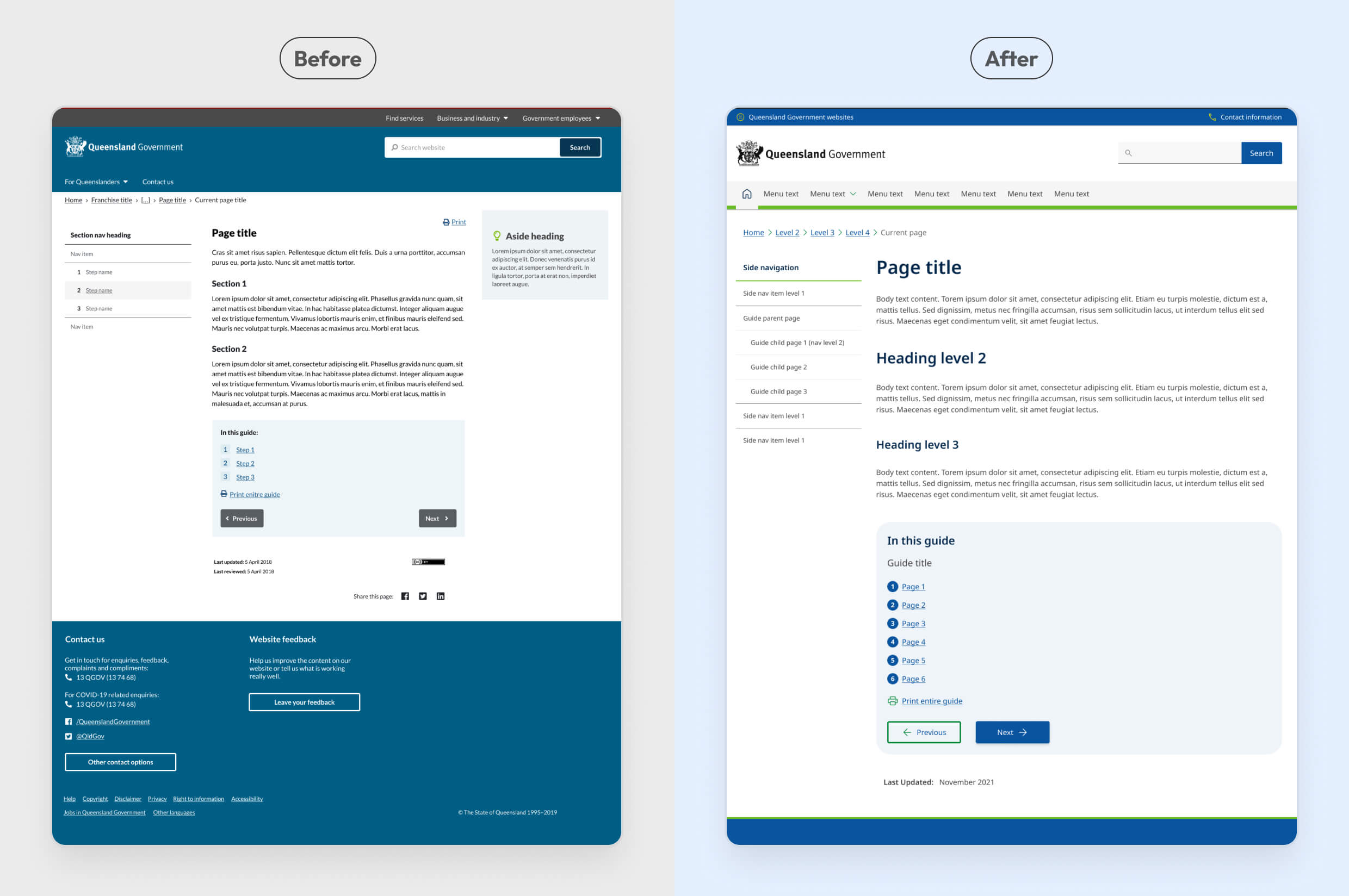
Aggregation and Guide pages, built for scale
Both the Aggregation page and Guide page templates carried a high volume of existing content, so redesigning them wasn't optional, whatever we built needed to work seamlessly with the new UI across everything already published under those templates.
A few smaller decisions followed the same logic without needing their own story: image variants like enlarge and gallery were redesigned rather than dropped, since they were already in active use, and a temporary custom footer was built to preserve an existing feedback mechanism the new core footer had no place for, with alignment work planned for a later phase.
Delivery at scale
Uplifting 9,500+ pages
qld.gov.au's 9,500+ pages are all built from a shared set of templates and components, not designed one by one. That meant updating a single template or component would flow down to every page built with it, unless a page carried its own custom code on top, which is where the parallel effort to reduce legacy customisation came in.
So rather than uplifting thousands of pages individually, the real work was confirming what already matched the new system, redesigning what didn't, and retiring what no longer earned its place. Once that was done, the rest of the platform came along for free.
Redesigning 22 patterns
10 templates and 12 components had no equivalent in the new design system. I worked with a graduate designer to define new designs for each, mentoring them through the process end-to-end, testing and refining solutions through design crits and peer review before handoff to development, then running design QA before they were uplifted to production.
Redesigned templates
A Figma extended set for qld.gov.au
Since these 22 patterns extended beyond what the core design system offered, I established a dedicated Figma extended set to house them, documented consistently and aligned with the core system's styles, so qld.gov.au had a single source of truth for its platform-specific patterns, and any future work on the site could build from something coherent rather than starting from scratch again.
Bringing 17+ agencies through the change
qld.gov.au already ran on a single shared platform across 17+ agencies, the challenge was uplifting the UI to the new design system without disrupting how those agencies worked day to day. Once decisions had been made about what to keep, redesign, or retire, I communicated those decisions to all 17+ affected agencies, explaining why, and what they needed to do before the new design system went live.
A parallel effort was underway to reduce custom code that agencies had built on top of the legacy system over time. I was pulled into agency meetings to support that work directly, helping teams understand how their own custom implementations would need to change under the new system, reducing technical debt and making the platform easier to maintain going forward.
Assuring the platform before launch
UAT ahead of launch was a major undertaking in its own right. Every agency ran its own UAT review of their content on the new design system, in parallel with a platform-wide review the core team led across the top 600 pages, a broader pass covering the whole platform, not just the newly built assets.
I was responsible for triaging and sorting the 140+ resulting defects raised by the design team, routing each to the right developer based on severity and by whether it was a design/development issue or a pre-existing content issue, alongside the parallel process agencies used to flag and resolve their own content-readiness issues.
Outcome
A controlled transition at scale
qld.gov.au launched on the new design system with all high-severity issues resolved before go-live. By retaining the site's established structure and focusing the migration on its UI, components and patterns, we limited the amount of simultaneous change introduced to a platform serving more than 300,000 visits a day.
A foundation built for future change
The outcome wasn't simply a new visual layer. Across 66 templates and components, we challenged what the platform still needed, retired 17 legacy patterns, redesigned 22 genuine gaps, and deliberately deferred two complex problems rather than forcing them into the migration.
The work reduced the amount of legacy design the organisation needed to maintain, aligned qld.gov.au with a shared government design system, and established a more consistent, scalable foundation, one that the next phases of work, redesigning wayfinding and a major content uplift, could build directly on top of.
That foundation was tested sooner than expected. When Queensland Government later rolled out a government-wide colour change, qld.gov.au was able to adopt it quickly and consistently, work that would have been far harder to coordinate without the shared design system this migration put in place.
What comes next
Improving how people discover information
Modernisation of wayfinding patterns to create clearer pathways through information and services across a complex 9,500+ page digital ecosystem, while supporting a staged transition approach.
Designing scalable experiences for content uplift
Scalable page shells, templates, and interaction patterns for a major content transformation.