Scalable interaction patterns
I led the creation of scalable and repeatable interaction patterns applied across 14 UI components, establishing consistency and elevating accessibility beyond compliance across more than 10,000 government web pages

The challenge
Government websites use over 14 types of interactive UI components, including in-text links, buttons, accordions, tabs, menus, breadcrumbs, and link lists. Historically, these components were designed in isolation, resulting in inconsistent appearance, behaviour, and accessibility. The project aimed to create a unified approach to designing and managing UI components across the enterprise level design system.
My role on this project
- research
- design
- release planning
- communications
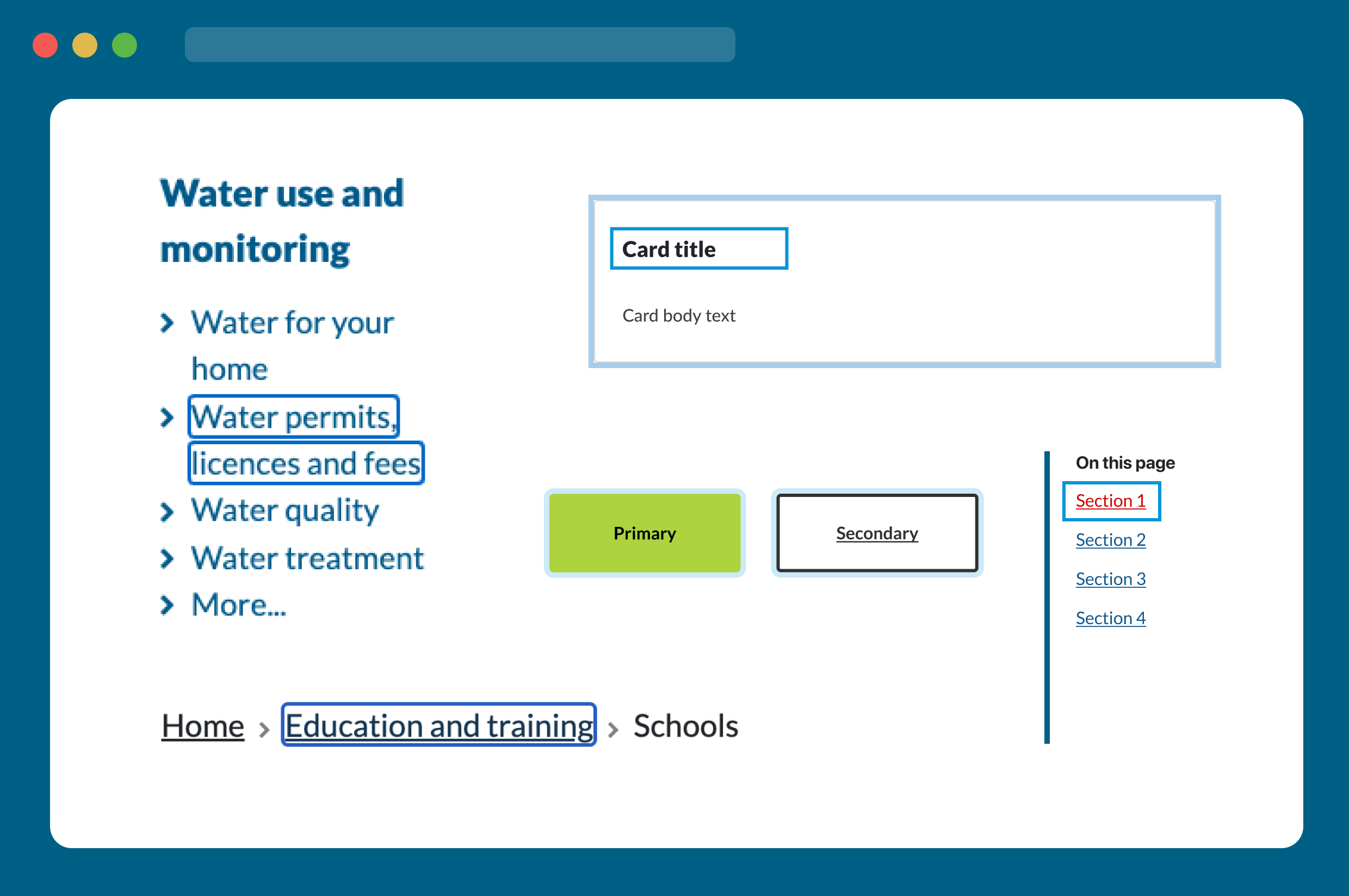
Before and after
Interact with the tabs to see how things looked before and after this project.
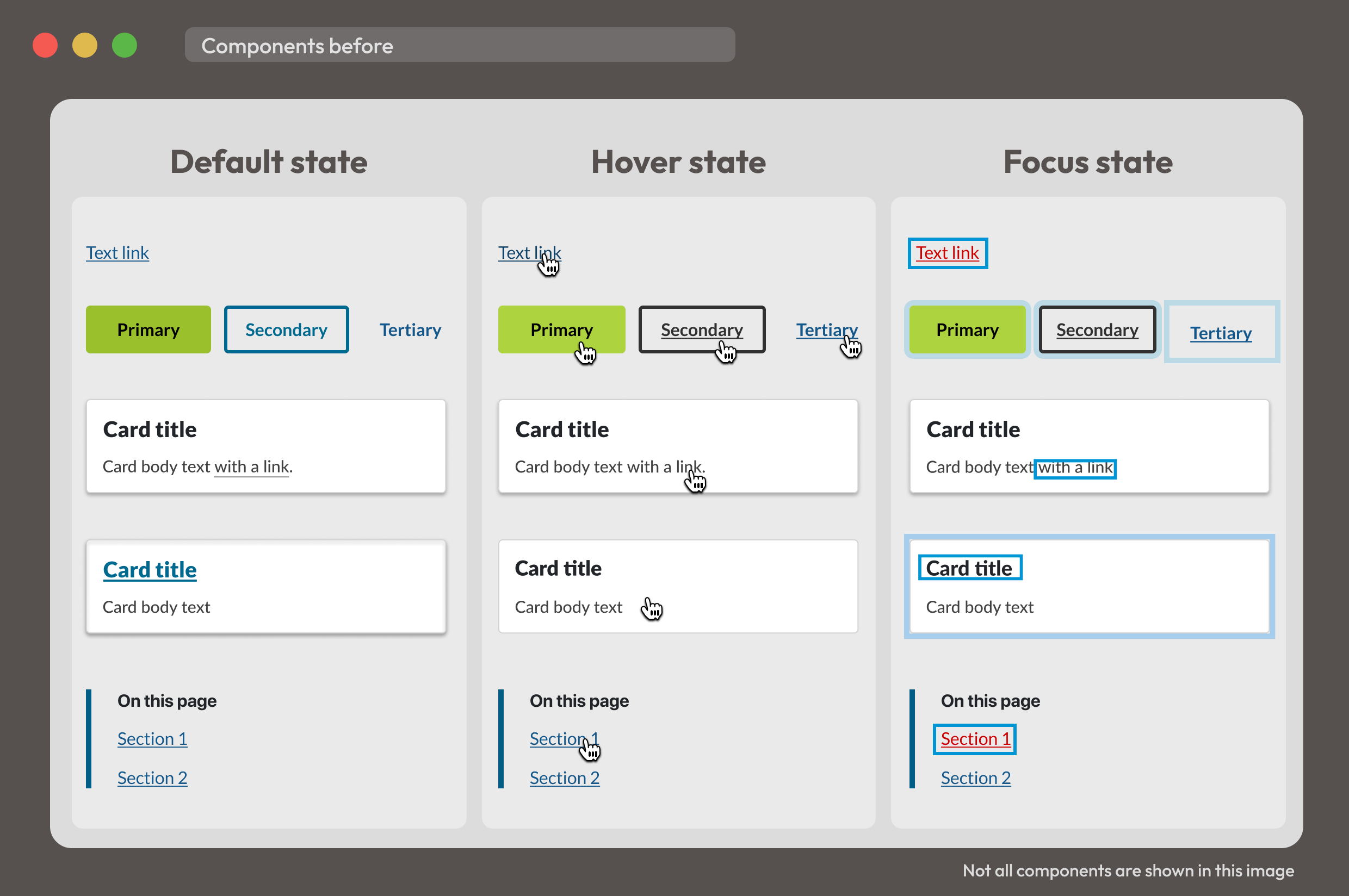
Before
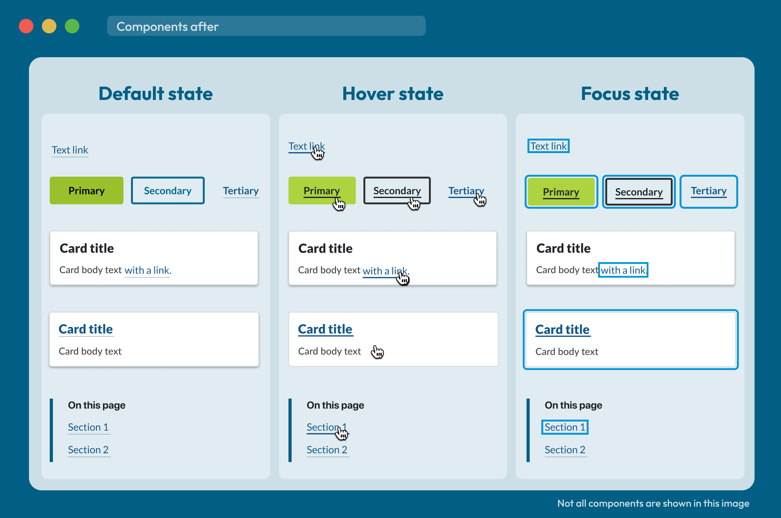
After
Project achievements
Established consistency, scalability, and a modern UI
I created foundational design system patterns and guidelines that standardise interaction states (default, hover, focus, and active) across all interactive UI components. These scalable, accessible patterns bring consistency to behaviour and appearance, and can be easily applied across design systems to support evolving teams and projects.

By collaborating closely with developers, I ensured every solution was technically feasible and built for long-term sustainability. I documented the patterns within the design system to future-proof implementation and enabling consistent, accessible experiences at scale.
Beyond function, I introduced a modern, streamlined aesthetic. Updated guidance on line weight, spacing, and colour improves readability, reduces visual fatigue, and elevates the overall user experience.
Enhanced accessibility beyond WCAG standards
My accessibility-first approach considered how people read and interact with content. I combined WCAG and inclusive design principles with reading science to address real-world challenges, particularly for users with dyslexia. By refining underline placement, spacing, and weight, the designs improve letter and word recognition, making navigation more accessible and readable for everyone, and going beyond what WCAG alone requires.

The design process
Audit
This work started with an audit where I explored how interactive UI components were displayed across government websites. This examination unveiled the following key findings:
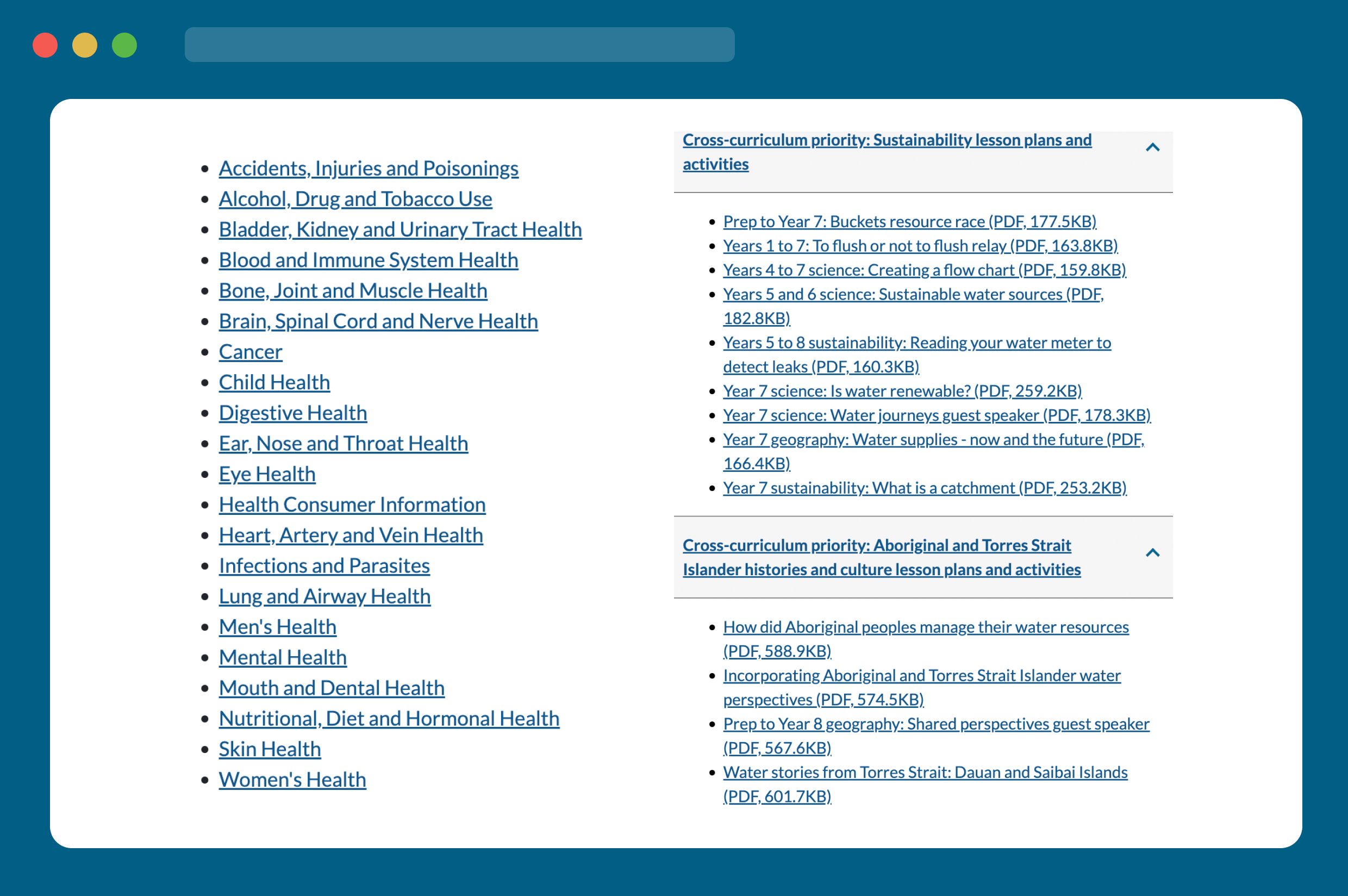
Significant use of in-text links
Due to the nature of government websites, cross linking content is common practice.
Aesthetic distractions
There are so many links the underlines overpower content.
Inconsistent UI patterns
Inconsistency in affordance and design across components, particularly in focus state. Focus state also didn’t meet contrast requirements.
Research
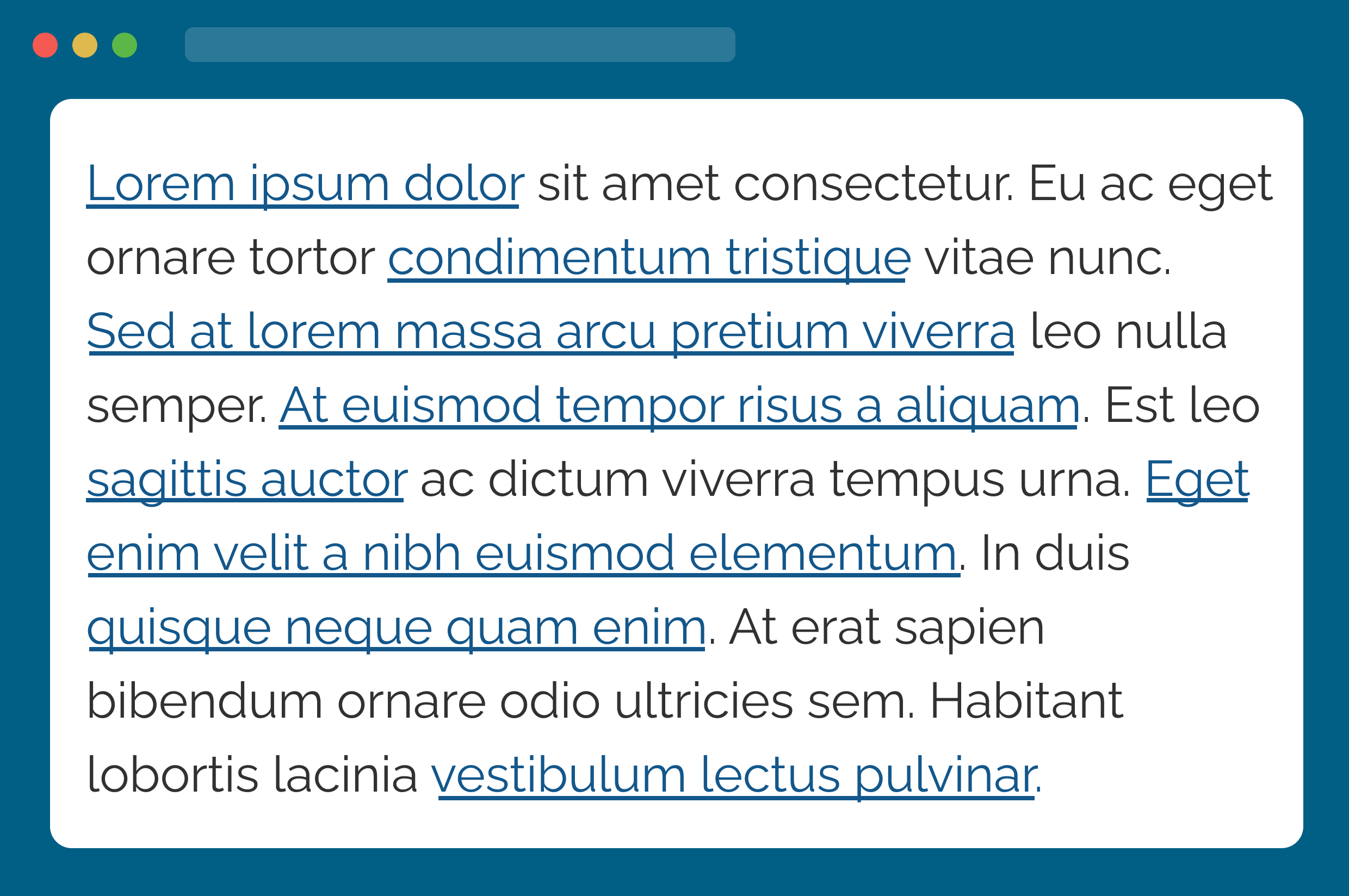
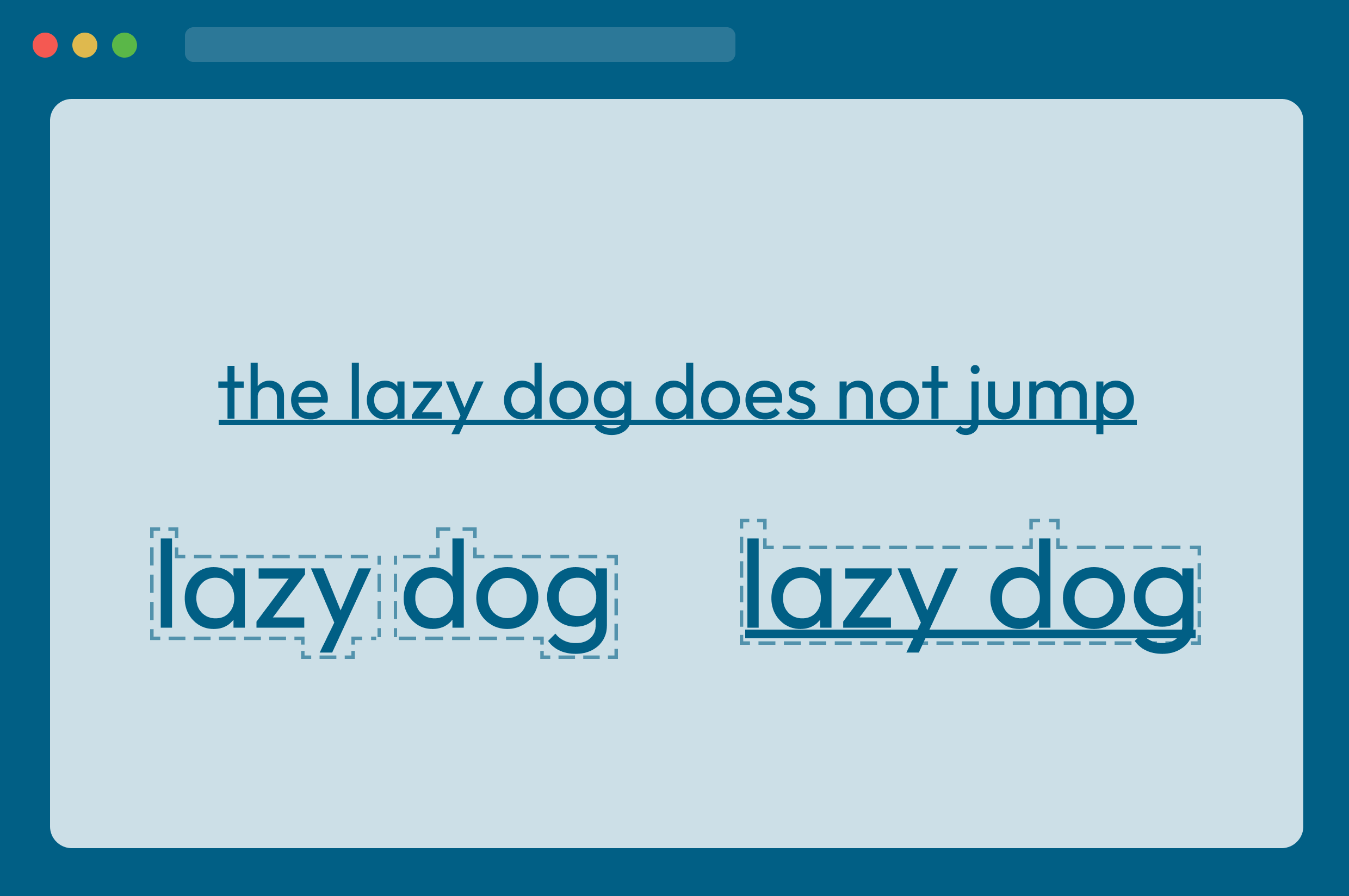
Research revealed that underlined links can negatively impact readability for users with dyslexia or other cognitive barriers. The underline disrupts word shapes, making it harder to distinguish letters and maintain reading flow. I used this insight to propose accessible link styles that preserve clarity while ensuring links remain clearly identifiable.
Content readability challenges
Underlined links overlap with letters like j, p, g, q, and y. This hinders correct letter and word identification for some readers and adversely affects content comprehension.
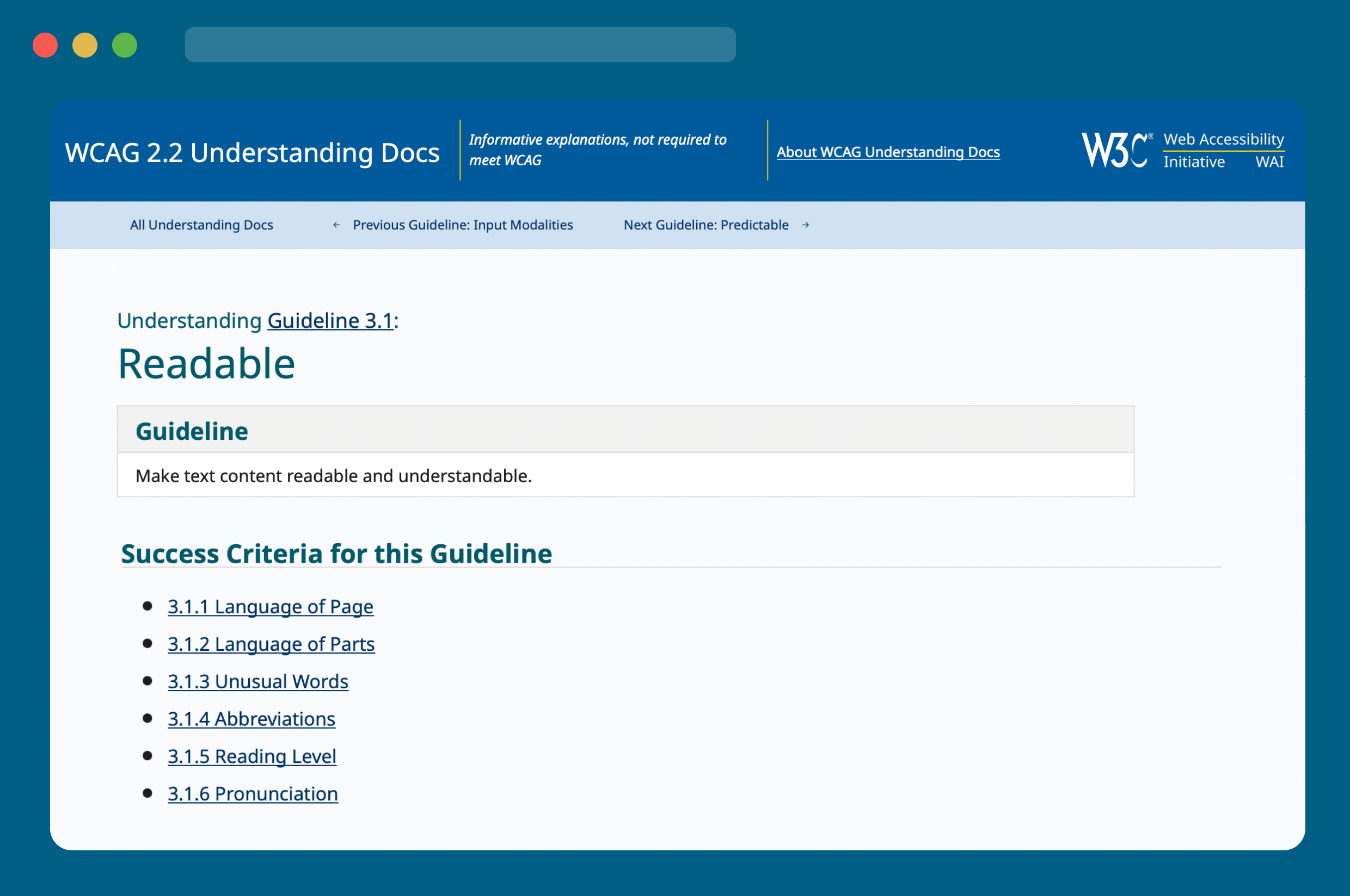
WCAG limitations
The Web Content Accessibility Guidelines (WCAG) currently offers limited guidance for addressing cognitive disabilities and reading difficulties, particularly in terms of letter/ word identification and comprehension.
Defining the audience
Through comprehensive research exploring how people read, barriers to reading, and existing accessibility guidance, I was able to define and categorise an audience affected by this problem into three key groups:

Citizens with cognitive barriers to their reading ability
Cognitive barriers include low literacy, dyslexia, difficulties in comprehending overly technical content, reading in unfamiliar languages, and struggles with typography that is hard to read.

Citizens experiencing physical barriers to their reading ability
Physical barriers can be situational such as viewing content on low-contrast screens or in bright sunlight, or permanent such as vision impairments, and motor control limitations.
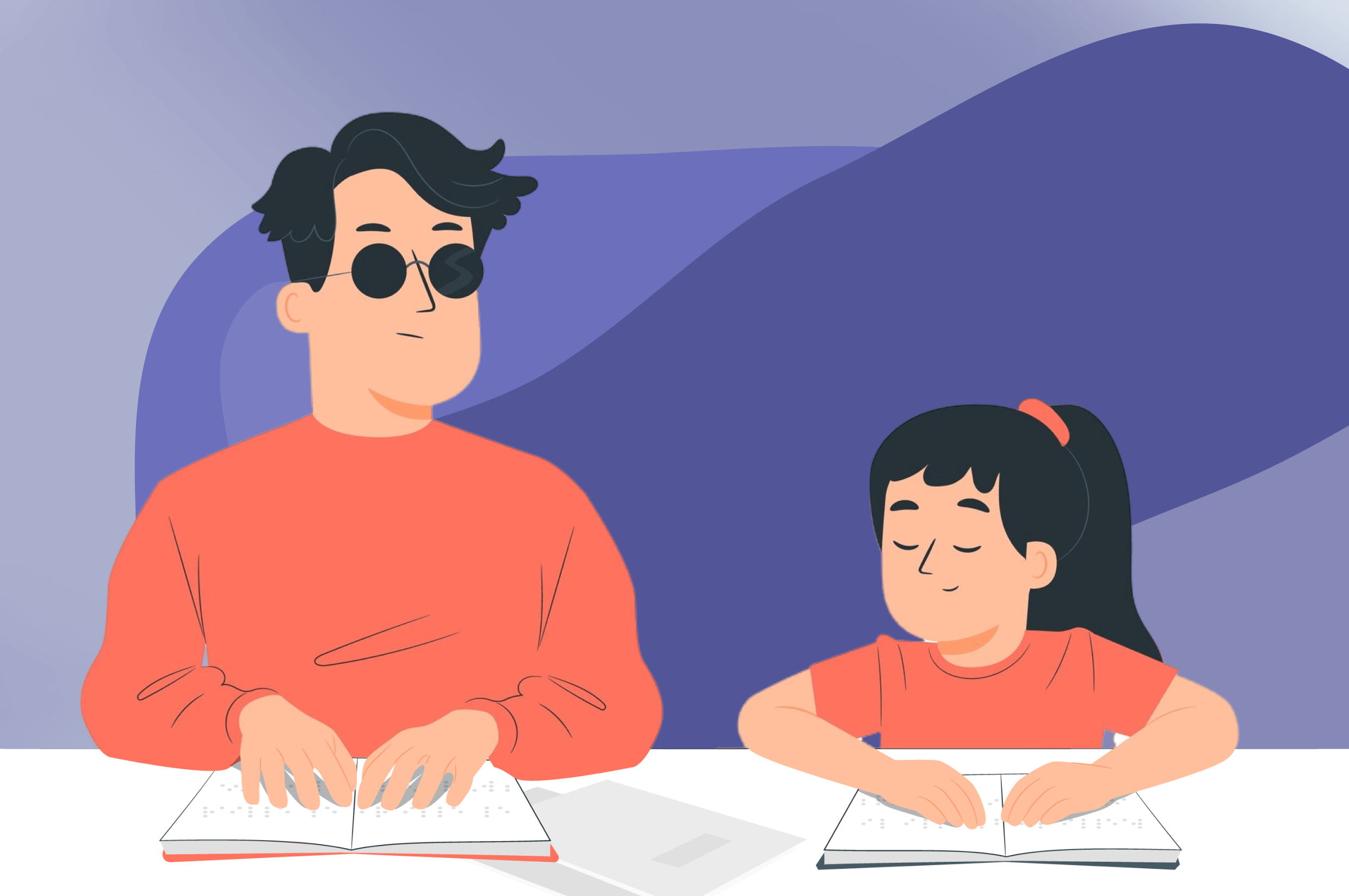
Citizens with impaired vision
This broad category encompasses individuals with vision impairments and colour blindness.
Problem identification
Instead of jumping straight to solutions, I started by understanding why the problems existed in the first place. I combined insights from my research and audit to uncover how design and content practices contributed to inconsistent interactions.
Using the "5 whys" strategy to uncover core issues
- The standard design of HTML links overlaps with letter descenders.
- The standard underline beneath in-text links is very prominent, and while this is beneficial, in can also be distracting when overused.
- Without repeatable patterns for UI component design inconsistencies arise across appearance, behaviour, and accessibility.
- Limited guidance provided by the WCAG around character/ word identification and comprehension.
Exploring and testing solutions
Working closely with developers, we identified technical constraints and shaped scalable, accessible solutions. I also conducted desktop research to see how others approached similar challenges, and partnered with fellow designers to rapidly prototype and test a range of options.
Design and build
Designing for scalability
By defining foundational details for interactive UI components, including underline position, hover behaviour, and focus states. I created a scalable, cohesive experience that ensures consistency as the design system evolves.

Updating all components with the new foundational design patterns
Starting with the Figma designs, the new foundational design patterns and guidelines were then systematically applied to all 14 interactive UI components and their variants in the design system.
Before

After
Implementing change across multiple platforms
To drive adoption across a large state government ecosystem, I strategically rolled out the updated patterns through the design system I was leading.
To influence change at a larger-scale, and encourage wider uptake, I actively showcased the work across forums and cross-government channels, prompting other departments to adopt the new standards for their own websites. I secured stakeholder buy-in by demonstrating the wide-reaching impact of the changes and highlighting the broad spectrum of accessibility needs these updates addressed. I also provided hands-on support to teams during implementation, helping embed the patterns into real-world projects.

In production
Before

After

Before

After

Beyond this project
I have published a complementary article to this case study, detailing the research and designs created for this project. It has resonated globally, with readers widely sharing it among their peers, transcending language barriers, including Japanese and French.
The article is titled: Designing dyslexia-friendly components: accessibility insights and atomic design patterns and is available to read on medium.com.
